Monday, September 15, 2014

Le Fin!

That's it!

It's been a fantastic summer of exploring what it really means to be an artist through this project. One thing that I have not talked about in my blog was the writing process for creating Genesis, and I suppose that is because it is a hard thing to describe or explain with real clarity. Especially in talking about poetry. One of my favourite poetry critics, David Orr, of the New York Times Book review said poetry is more like a place that you go and explore than something you, as a reader understand. Poetry, he says, is more like Belgium. If you are going to Belgium you don't memorize the phone book to understand the culture. Instead, you hang around and enjoy it, learn about it through being with it and in it.

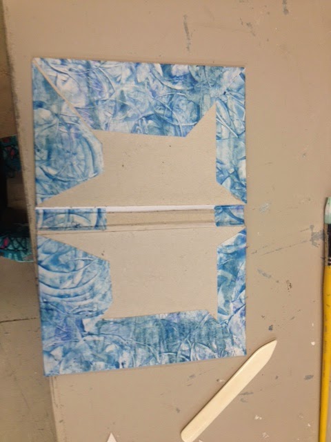
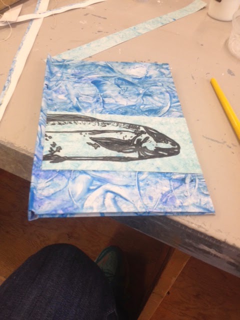
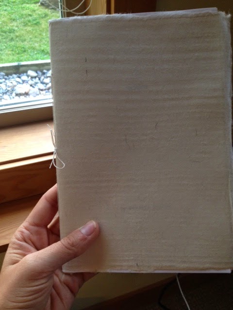
When I was setting out to write this chapbook, I wanted to write about fish because fish are a very rich cultural symbol. Fish are often said to symbolize fertility and abundance, birth and rebirth. The journey of exploring this metaphor, translated more into an exploration of myself and the season of my life that I am in. As a collection of poems, I was surprised at how things came together. I feel, now that the book is complete and printed, that it was really an act of coming into adulthood in some ways. The process helped to teach me how to take a thought or idea or image, and explore that thing, and even now I feel like I only just scratched the surface.

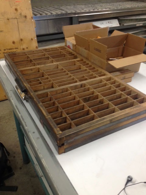
It was an absolute pleasure to work with Briar Craig this summer. He is a very generous teacher and an incredibly talented print maker. Likewise, it goes almost without saying, that it was a pleasure to have Nancy Holmes as my supervisor for this project. I am so lucky to have such talented teachers, who have supported and mentored me.

I will be launching this book as a joint launch and gallery exhibition with another book that I worked on in the past year. The show is called Baptism - A Happening and will feature Daylighting (a collaborative book of poetry about Rutland, (Kelowna) written by myself and Sarah Megan Hunter), Genesis, and artworks that were inspired by these two chapbooks. Baptism - A Happening will be taking place in the Alternator Centre for Contemporary Art, here in Kelowna, and the opening will be held on October 3rd, 2014.


Monday, September 8, 2014

Book Binding round 2: Hardcover Books

On the course of building my books, I did three different covers: 2 soft cover (with different colours of paper) and a hard cover edition. Here are some instructions on hows to make your own hardcover books!


The first thing that you need to do when creating a hardcover volume is to find a material that will sit under the cover paper to give it the desired stiffness. For my books I used mil-board, but you can use just about anything that is hard and flat, like cardboard or wood or what-have-you. Then you cut two rectangular pieces for for the cover and one thin rectangle for the spine. The rectangle for the spine should be the same width as the width of the book when it is laid flat.


Lay out the pieces as shown in the above image and cut the cover paper so that it is easy to fold and glue.


Glue down cover paper and smooth with a bone folder. Then get your text block signature that you want to go inside and glue down the outer sheet.


And away you go! This method is very similar to the one I used for the other covers, and just as before nows the time to put your book under some weight and leave it over night so that the glue can set. Presto! hard cover books!


Thursday, August 28, 2014

Now We're Almost There

Alright, it is August 28th, and the project has almost reached it's exciting finish. I can now safely say that I have created 25 copies of my book. It was a big crunch to get everything done before heading to Calgary for the last week of August, and I didn't quite make it; there is still some final gluing that needs to be done in the next couple of days. That said, the text blocks for each book have been folded into single signatures, bound and editioned, and the covers are folded and ready to be glued.


Using screen printing has been a really interesting way of making this project happen. Initially I was going to do the whole book in "duo-tone", meaning I would be using two layers of ink. After, doing some tests of the second layer of ink I decided to keep this only for the images because properly registering all of the pages of text would take more time and paper than I have. Mostly paper. Have I mentioned this before? I know I have. Starting any printing project means using way more paper than you would expect. Doing the whole book in duo-tone would mean making twice as many first layer prints or more with the expectation that on the second layer, I would probably waste half of my attempted prints. Anyway, here is a quick pick of how one of the images turned out.


After getting everything folded, I bound the signatures using a 3 hole bookbinding stitch, using bookbinders thread. Super simple but it did the trick.


The outer sheet of the signature will become the inner part of the cover once the books are all glued together. Here, I used some beautiful mulberry paper for two reasons: 1) it is super pretty (obviously!) and 2) Mulberry paper is really strong and archival quality. This is because the mulberry fibers that are used to make the paper are very long. Because this paper comes in the wrong size for what I was doing I had to trim the paper. I did this using water and tearing it rather than cutting it to size because I wanted to keep the nice edging on the paper. 

I also glued the covers together, so now they are are all ready to be put together with the text block. To do this, I used some small Litho stones that we have in the print shop for weight. 


Tomorrow, I will be heading back to Kelowna and back to finish with the final gluing of everything. Onwards!


Wednesday, August 13, 2014

10 Things I Have Learned: a bookmaking list

The internet has inspired me to make a list.... with pictures! 

(and I stole them all...)


1. As with life, anything that can can go wrong, probably will.


2. You will run out of the paper that you want the most.


3. You will be unable to find satisfactory paper and will have to either order online, or get crafty.


4. You will feel like you are using an entire forest worth of paper.


5. There are a million ways to bind a book, pick one.


6. The simplest binding is the best binding for short books in large quantities.


7. Have a REALLY good mock-up of your text block. Without this, likely you are either a computer or your pages are everywhere.


8. Measuring and cutting will take twice as long as you think.


9. Always work on a clean surface, because once there is stuff on your paper, that't it for that paper.


10. If you are using letter press, make sure there is enough type for what you need it for, because you will run out of that too. 


Wednesday, August 6, 2014

Book Binding At Long Last!

At last! I have reached the Promised Land! Today is most definitely the first day that I have really felt like I am making books. Now that I have gotten together many of the materials that I need, and I know which direction (sort of) that I am going in, I can start actually making books.

Today, I assembled two different books, filled with blank paper to practice before I settle on a design and work away at the text blocks to fill them. As I mentioned in my last post, I will unfortunately have to give up the ghost of lead type for my text block. Instead, I will be doing the entire book using screen printing. The initial image of the text will be designed and typed on a typewriter and then transferred to screen... but that whole hurrah will be discussed in a different blog post!

The first book is a folded "soft-cover". The cover is made with a light card, called Casan Mi-Teinte turquoise, that I folded and attached the would be text block (in this case blank pages) to. I cut and pasted one of the screen print fish that I designed for the cover onto the card before folding.


The important thing with this type of cover design is that you want the length of the paper that will become your cover to be twice the length of the final cover size so that you can for it in on itself. I wanted my cover to be 12" X 9" so the paper that I am using in this pic is 24" X 9". Make the first fold directly in the middle of the paper. Next, measure and mark 6" from the center fold on either side. Fold where these marks are "hamburger"-wise as the kids say, or in layman's terms parallel to the first fold. This is your cover.


 Next, you get the "text block" ready. I did this binding the text pages together, or the guts of the book shall we say, using a simple 3 hole pamphlet stitch. You can find super easy instructions for that here (this is the site I used!).


Finally, take your guts and glue them to the two inner flaps using pH neutral binding glue. (The glue is important because other things will degrade over time eating away at the paper and all your hard work). The inner sheet that I used was a scrap of mulberry paper.

After all that's together, you may also want to press the book under something heavy. Unless you happen to have a bookbinding press lying around, which we just happened to have at UBCO, you can really use anything heavy for this: a cinder block, Michelangelo's David, you know, whatever you happen to have kicking around that will allow it to lie flat between two flat surfaces that cover the entire thing with pressure. If it's not totally covered you might end up with some kinks in your beautiful cover and we can't have that now. 

As for the learning experience today, I will be doing some more screen printed fish in a lighted contrast with more translucent ink to see how they look compared to the stark grey and black I used on the last ones. Also, I have come to the conclusion that I will be doing two editions of the book... one soft-cover and one hard cover. Stay tuned for next time when I explain how I will be constructing the hardcover versions of my book!


Tuesday, August 5, 2014

Printing Experiments Part 2: Converting an Etching Press for Type

Last week, my blog post discussed using the Adana Letterpress, courtesy of UBCO, for printing my book, and after some deliberation I came to the conclusion that the small printing surface that the Adana has would take too long to print my 24 page book of poetry. So this week, I am going to talk about how to convert an etching press into a flat bed letter press.

This is one of the UBCO etching presses.


The way that an etching press works is the heavy metal cylinder roles back and forth over the printing material to make an impression. The impressing surface lays on the flat bed that moves underneath the cylinder, then the material that is going to take the impression sits on top of that covered with padding that is most often made out of thick felt sheets. These felt sheets are intended to protect the metal cylinder and form around the paper and impressing material (in our case lead type) making a nice even impression.

The felt packing is really important because, when printing, I want to make sure that I am not damaging either the press cylinder or the lead type. If the cylinder is sitting too low it will crush the type, so the brass nobs at the top that control the distance between the bed of the press and the cylinder need to be just right.


In order for us to use the etching press, we first needed to find a tray that is the right height for the lead type to sit in. Luckily, Briar had a couple of these such trays hanging around for us to use. Next, we found and cut a wood board to the right size so that the tray with the type in it can sit down into the flat bed. It looks like this.


After that we were pretty much done and ready to set type using the same kind of system that we used in order to set type in the Adana, utilizing the sides of the metal board just as we used the chase in the Adana, to brace the type, furniture, and slugs.


After my adventures playing with the Adana Letterpress and the lead type that UBC Okanagan has at its disposal, I have come to the sad conclusion that we may not actually have enough lead type to print more than a half page of text. The problem here is that after a while you start running out of letters, and while it would be both fun and interesting to just start substituting letters (e's for x's or some such thing) to make it work, that is not really the effect I am going for.

Luckily after talking to the UBC Okanagan faculty about this particular hiccup the school is looking into buying a whole bunch more stock of lead type, furniture and drawers to use in print making! I can't tell you how exciting this is -- especially since I will hopefully be continuing on with more printmaking in September. All that said, we are still currently at a loss for type and the type that the school is buying is going to take about a month to get here. Which means that it won't be here in time for me to finish this current project.

All that said, the moral of the story is that I will now be filling the text block using screen printing. Which in the long run should take less time and will let me add sketches as well to the body of the work. It's all very exciting. Below is a sample of the first screen prints that I have done. These fish are going to be used as cover art.


Tuesday, July 29, 2014

Printing Experiments Part 1: The Adana

This summer has been an adventure in the realm of bookmaking, and, as per the norm of my blogging aspirations, I have not been recording them to the best of my ability!

The last few weeks I have had the absolute pleasure of working with lead type at UBC Okanagan's campus. UBCO is home to both Briar Craig (from whom I was able to post snippets of an excellent conversation we had in an earlier blog post) and an Adana model M0120-M0125 printing press.


But before I could really get started with using this little beauty I had to go about organizing some of the new type that I was thinking of using (Neon Century Schoolbook 12pt) into a type drawer. There are different ways of organizing your standard type drawers. One of the most common arrangements is the "California Type Case" that is set up as follows: 


So, I went about organizing the new set of type into a drawer. Interestingly, word "Neon" in the title of this font is an indicator of the specific typesetters that designed the font -- in this case the Chicago Typesetters. The word neon was added to the title to avoid copyright infringement on type of similar design. Our print shop at UBCO has both Neon Century Schoolbook and Neon Helvetica (both in medium 12pt as well as a set of Neon Helvetica 24 pt).


Once this was done I could start setting type. At this point a typesetter starts to set the type using a composing stick. Like this:


On the bottom, ledge part of the composing stick the typesetter first needs to put down a "slug". The slug is a piece of lead that the type is set onto. It acts as the spaces between lines and stops the letters from falling all over the place when you move the type off of the composing stick and into the chase. The chase is a metal square that the type is set into and tightened using block of strong wood (like oak). 

Setting the type and getting it to stay in the chase takes a long time, and this particular model of letter press can only do about a half letter size page of text. Which is fantastic, if you have a lot of time -- like a lot of time. It takes about 4-6 hours to set a page of type, and proof it. It takes another fair chunk of time to get the machine properly set to print consistently, through the use of rigging up bits of paper and other little shims and things to get all of the letters to print, and finally, printing your finished copies. That's the easy part, once you have done all that set up, printing on the final sheets of paper is a breeze... providing you get everything all inked up properly.

For my test run, I decided to print one of the poems from the book I am publishing for this project, called String Men. Here's a sneak peak! 


After creating the mock up for this project, I have organized my twelve poems so that I will be printing a text-block comprised of 24 pages. A 24 page text block breaks down to 12, 2-page plates, with 2 plates on each sheet of paper. Which means that the text block will consist of 6 sheets of paper. This is a huge endeavor for a little press. Setting one day per page and printing one day per page means, 2 days for each page. Meaning the shortest possible print time is 48 days. Based on this, the next thing that I am going to try is to convert the print studio etching press into a flat bed press. 

Stay tuned for Printing Experiments Part 2: Converting an Etching Press!